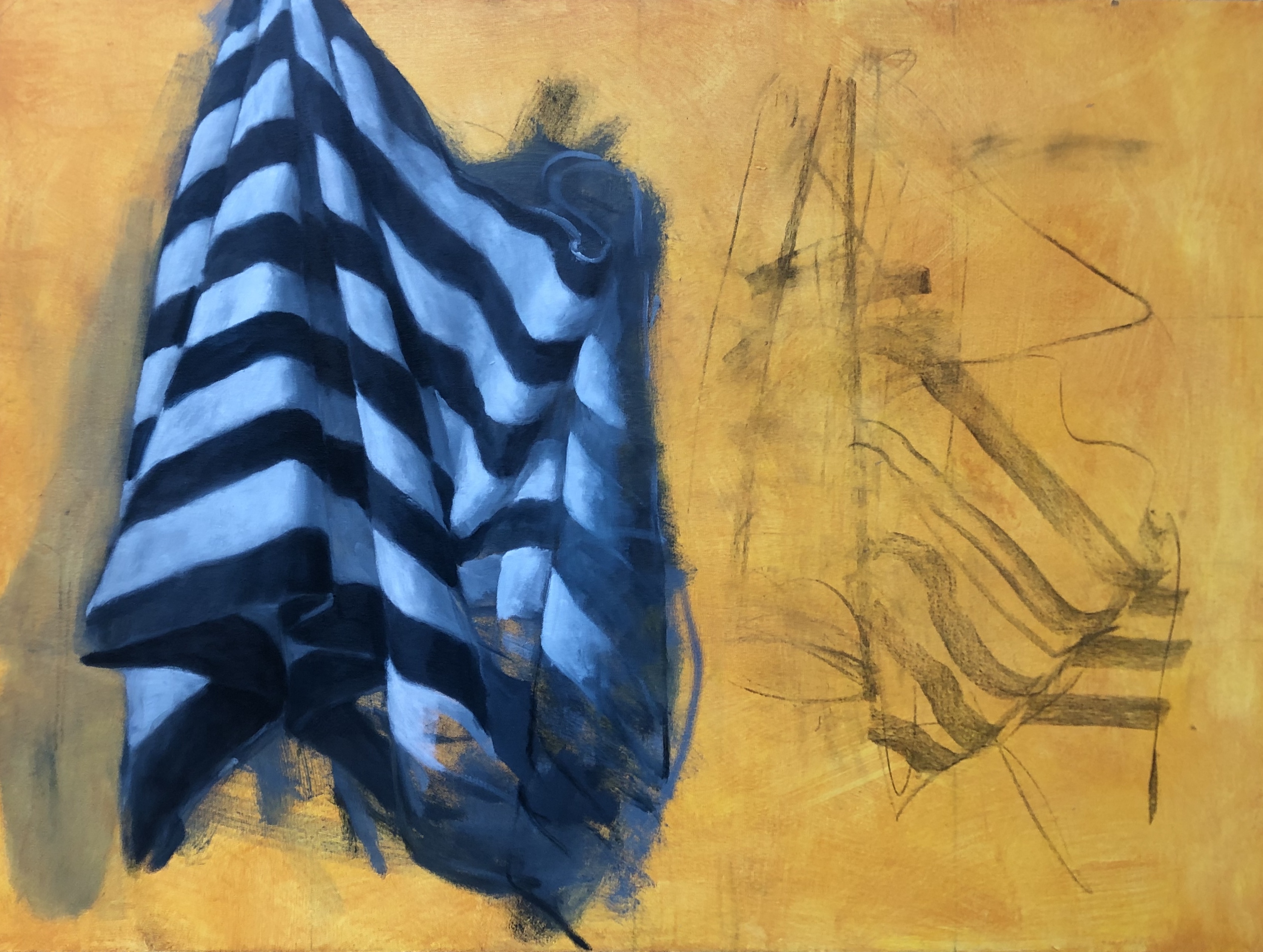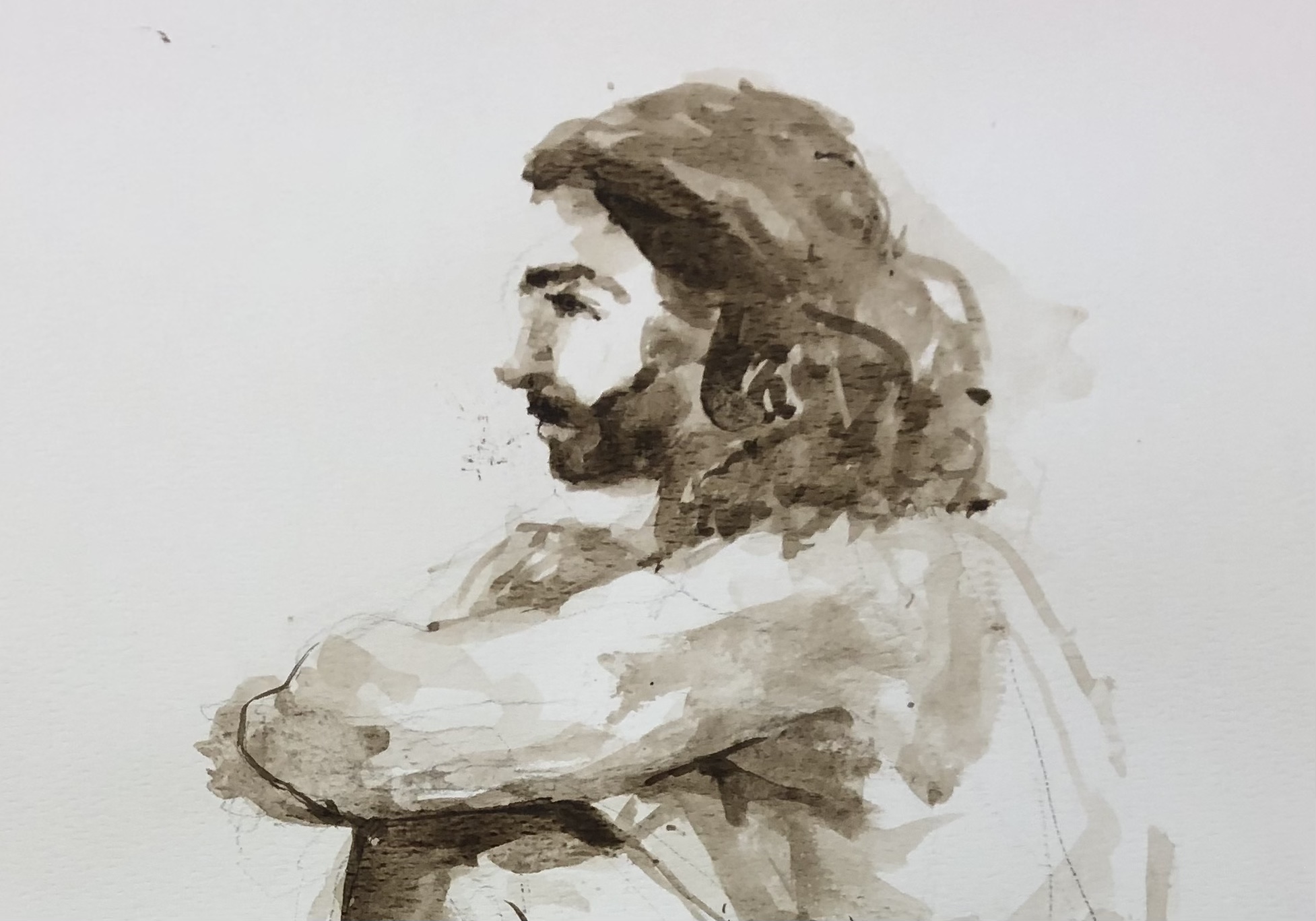
I’ve been doing most of my painting as demonstrations in teaching my painting classes, and in spite of all my good intentions I finish few of them at home in the studio. In part because I hear the teacher in my head, going over what I should be doing (I hate being told what to do) instead of letting go of expectations and allowing the painting to happen. Plus I get bored with going through the work on something if I’m not painting for the love of it.
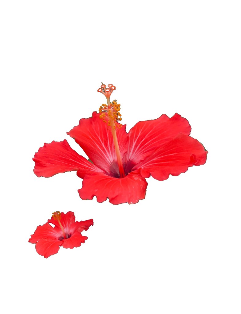
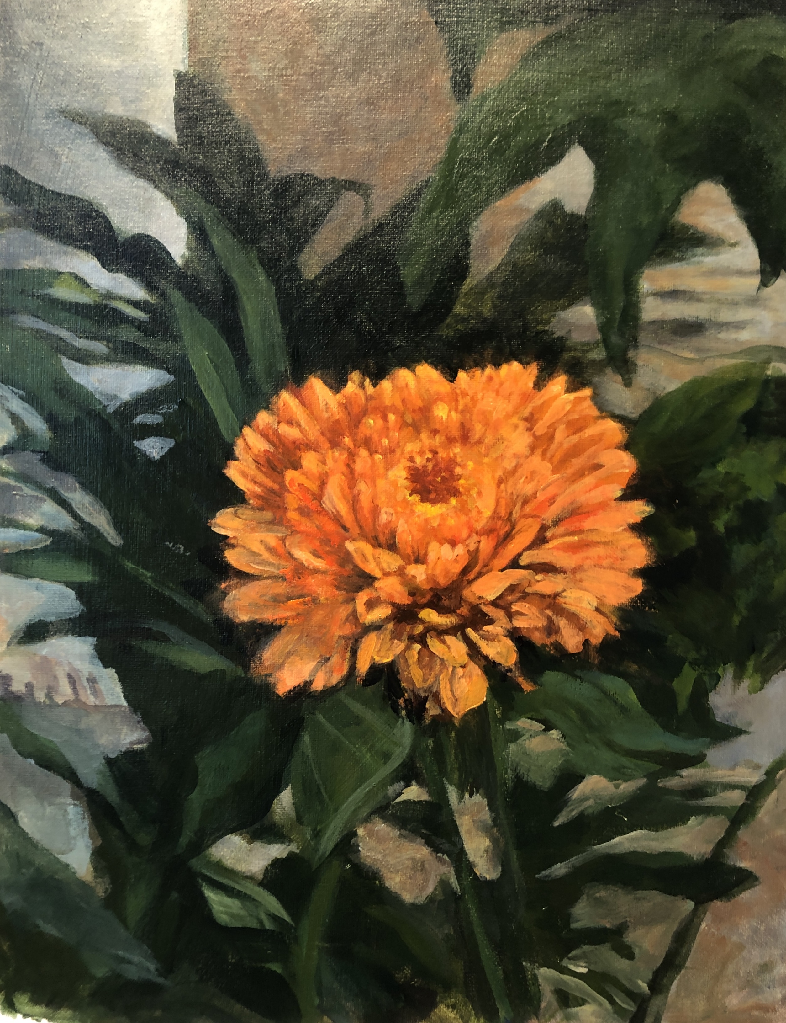
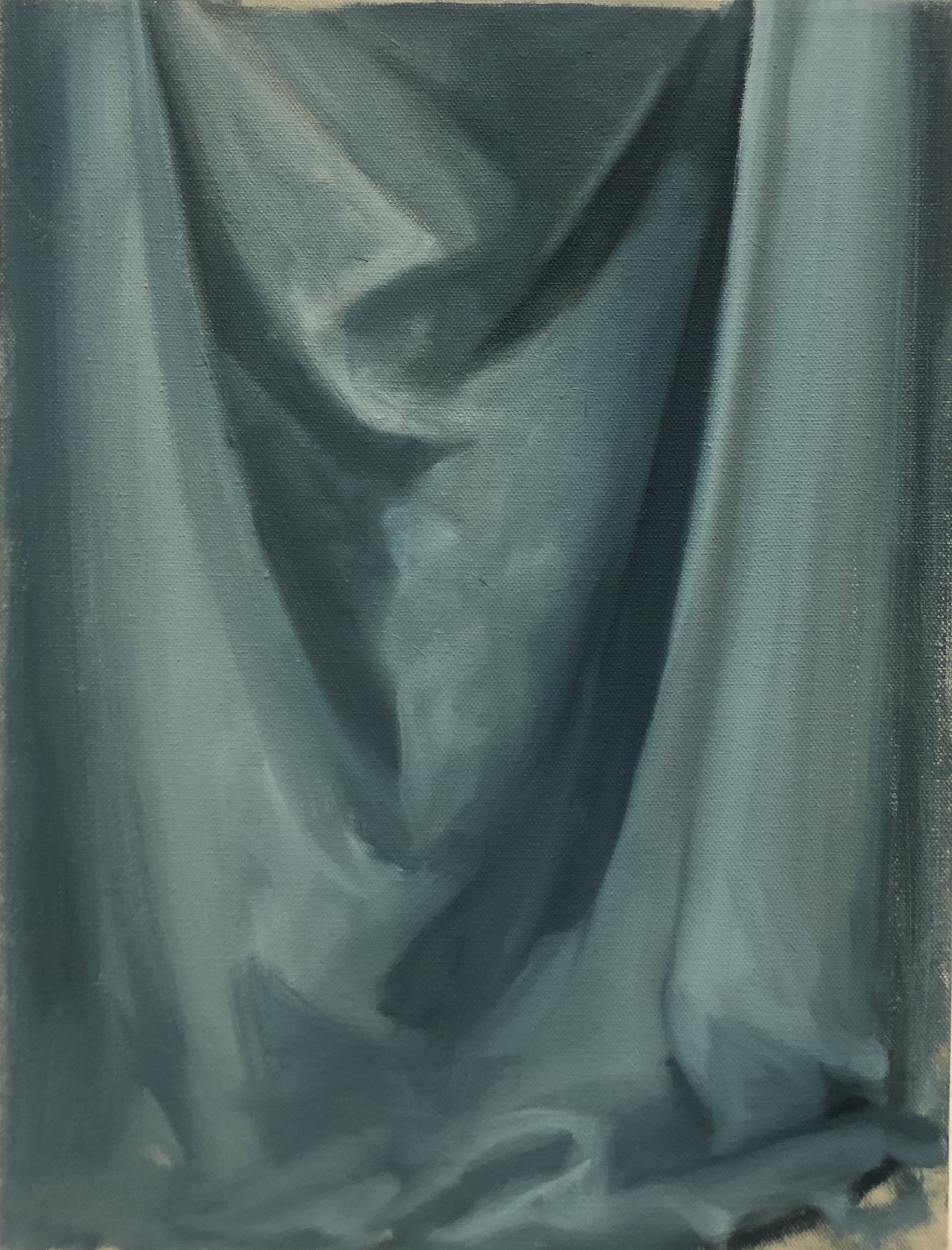
So I have begun to cut loose. A landscape and three flower paintings flew out in short order, within a couple of days, and I wanted to paint again.
The question then is “Is this a change of style or a one-off?” What would constitute the difference?
Could a change of style be an evolution of what you’d been doing but hit a wall, or does it need to be a complete break from the familiar? Clearly if you’ve hit a wall you must make a radical change of direction; you also might need to change your method of transport/delivery.
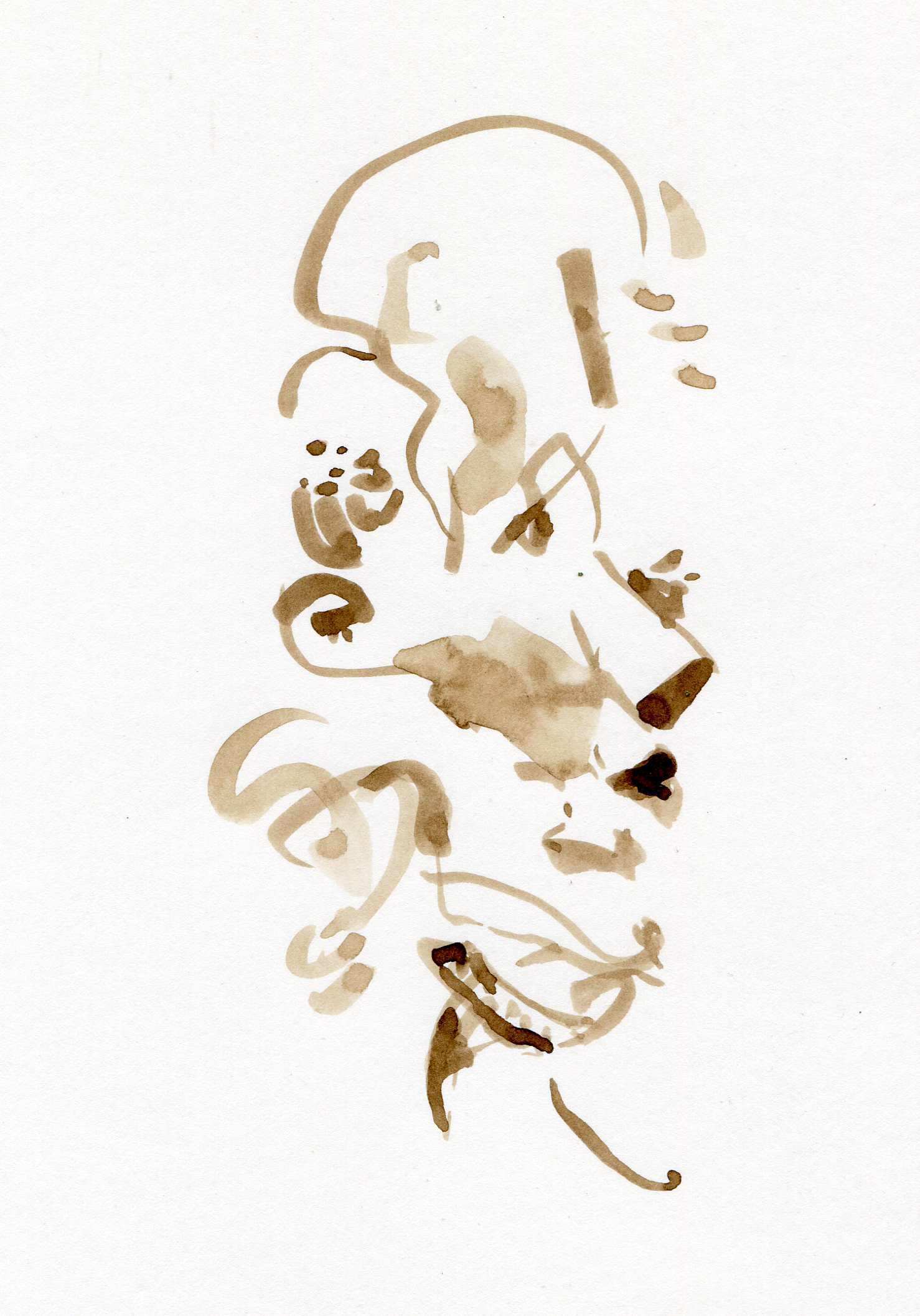
In my case that meant trading my brushes and carefully crafted surfaces for palette knifes and pieces of cardboard to paint with and trusting that voice in my head that says: “it needs yellow there, orange here, more turmoil there,” or “I don’t know what it needs so I’m going to hammer at it until it shows me what I’m feeling,” or “Back off, take a breath and focus.” Being in the zone is not only being willing to make mistakes but embracing them and taking advantage of them.
What would mark these paintings as one-offs? — If I couldn’t do it again. Most likely that’d be because of trying too hard to be spontaneous. I heard a Charlie Parker Quote on an episode of “The Hidden Brain” podcast recently: “Don’t play your saxaphone, let it play you.” Let go of expectations. Be open.
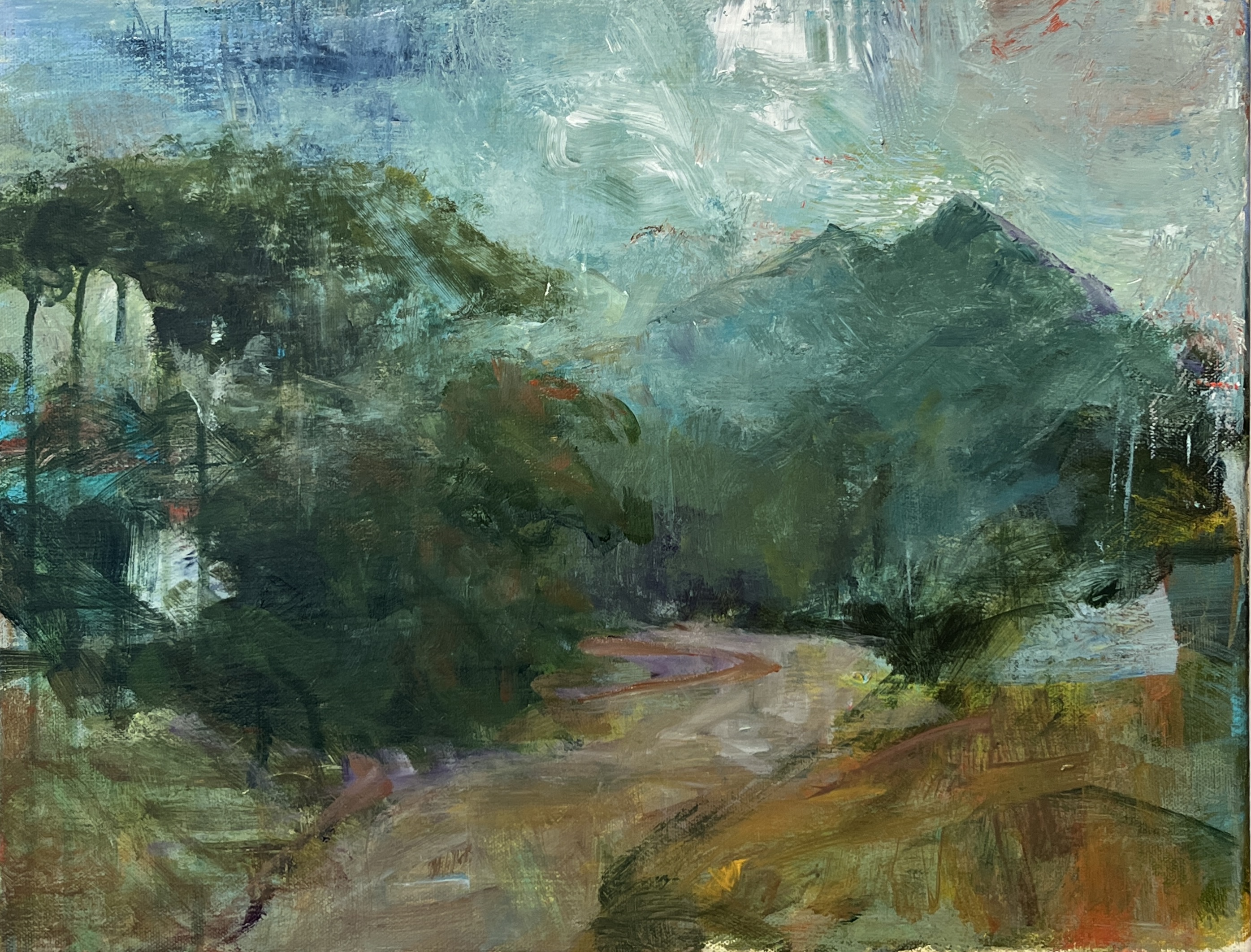
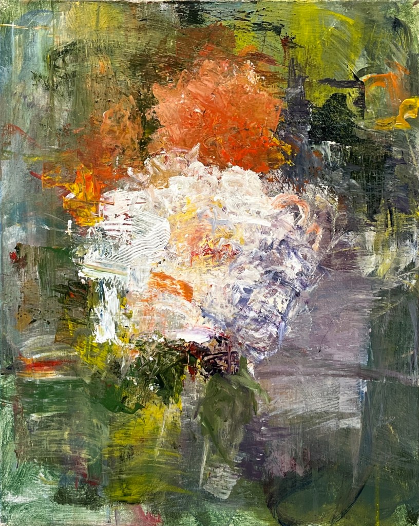
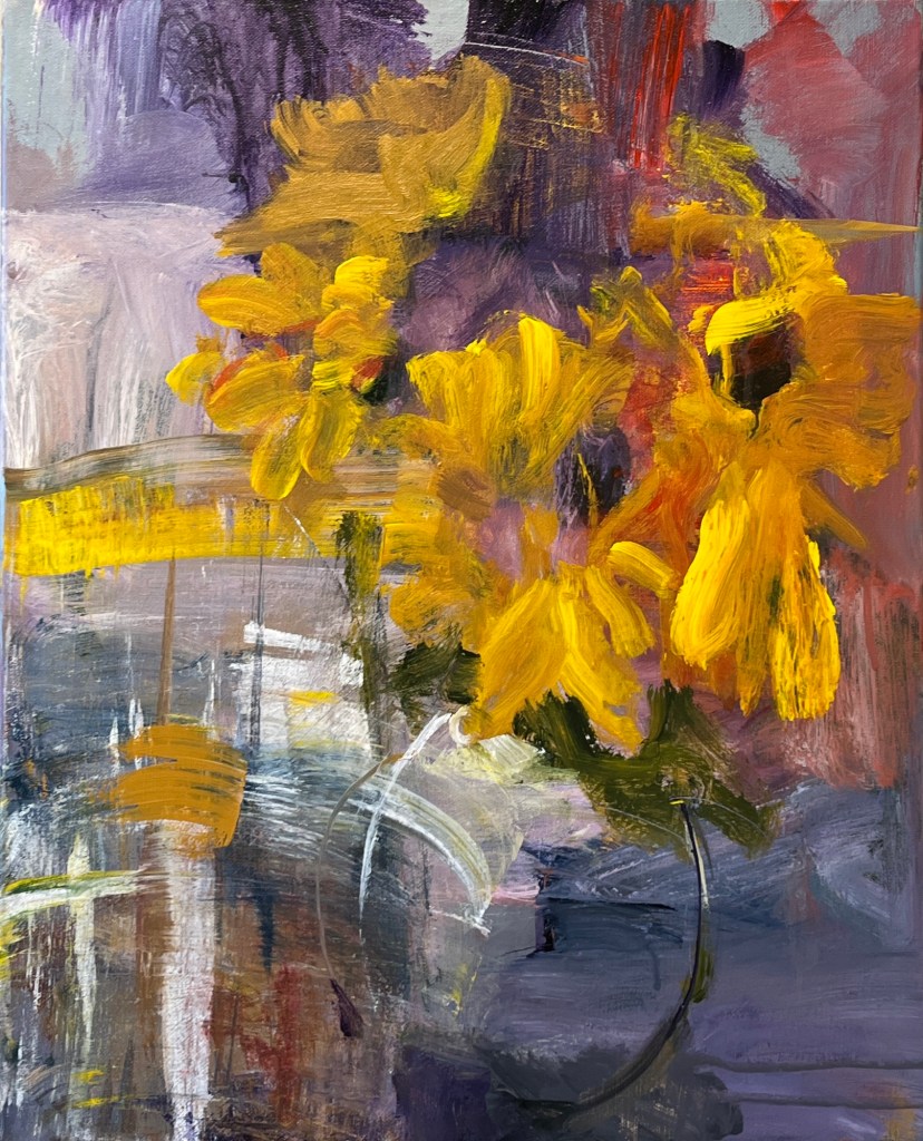
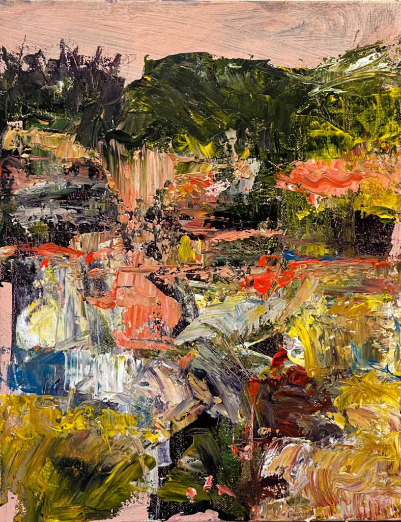
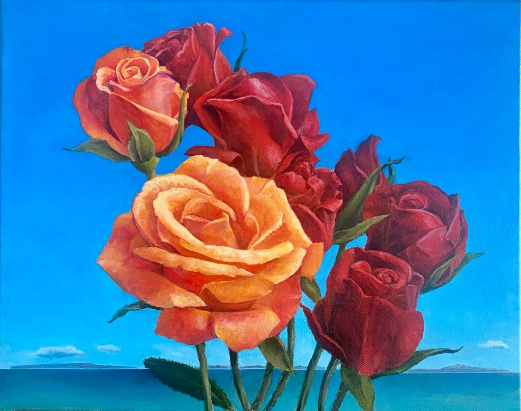
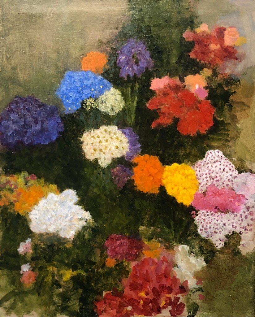
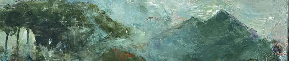
Each of the first three began with reasonable paintings – realistic with everything in the right place, yadda yadda, but boring for me. The fourth one is painted from a photograph of a florist shop on the street after painting the others.
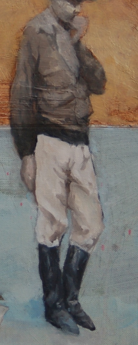
These are from three years ago.